The color comparison
Soft autumn vs soft summer: the difference
Two soft color palettes. See how they differ, then try the colors with clothes you already own.
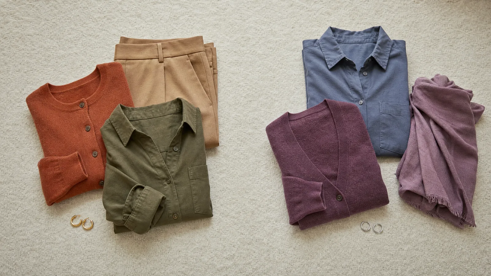
Soft Autumn and Soft Summer are easy to mix up. Both use soft colors that look a little gray instead of bright. The main difference is warmth. Soft Autumn leans warm. Soft Summer leans cool.
Try soft gold against silver, then camel against cool taupe. Use clothes and jewelry you already own. Look for the side that makes your skin appear even and your eyes clear, not the color you prefer on the hanger.
Soft colors, warmer or cooler.
Look at the whole group. Both are soft, but the warm browns and rusts feel different from the smoky blues and purples.
Soft Autumn
Soft Summer
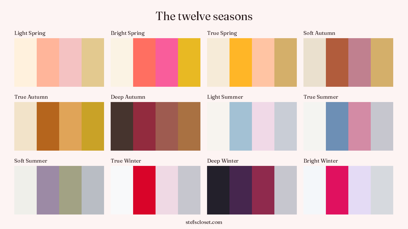
Colors from the Stef's Closet season palettes. Compare actual fabrics in daylight to see which ones you like near your face.
What do Soft Autumn and Soft Summer share?
Both seasons use gentle colors. Most are neither very light nor very dark. Hair, skin and eyes may also look close together in lightness.
That shared softness is why the palettes can look almost the same at first. Curate Your Style, run by sisters Hannah and Sophia Rashad, also says warmth is the deciding difference.
Two kinds of soft coloring.
Notice the hair and eyes, then the way all the features work together. Warmth is the difference to test.

Warm and softly blended.
- Warm brown hair and muted hazel eyes.
- The colors in her features blend gently.
That warm, soft mix is the idea behind Soft Autumn. Try Terracotta and Sage.

Cool and softly blended.
- Ash-brown hair and smoky gray-blue eyes.
- The overall effect is soft rather than bright.
That cool, soft mix is the idea behind Soft Summer. Try Dusty Plum and Steel Blue.
These are example color patterns. A season includes many skin tones and eye colors. You do not need to look like the example. Hair and eyes give clues; compare fabrics near your face before choosing a season.
How can you tell them apart?
Compare warm and cool colors that are equally soft. Curate Your Style recommends soft gold versus silver, camel versus cool taupe, and warm cream versus cool off-white.
- Stand by a window in indirect daylight and remove any strong makeup.
- Hold one warm option under your chin, then replace it with the cool option.
- Watch the skin around your eyes, mouth and jaw instead of staring at the fabric.
- Photograph both versions from the same place if the difference is hard to remember.
- Repeat with two more pairs before you decide.
Do not decide from one pair. A warm result should show up more than once. The same is true for a cool result. If your answers are mixed, try again in better light.
Same light. Same spot. Change the fabric.
Face a window with soft daylight. Compare one fabric at a time, keeping everything else the same.
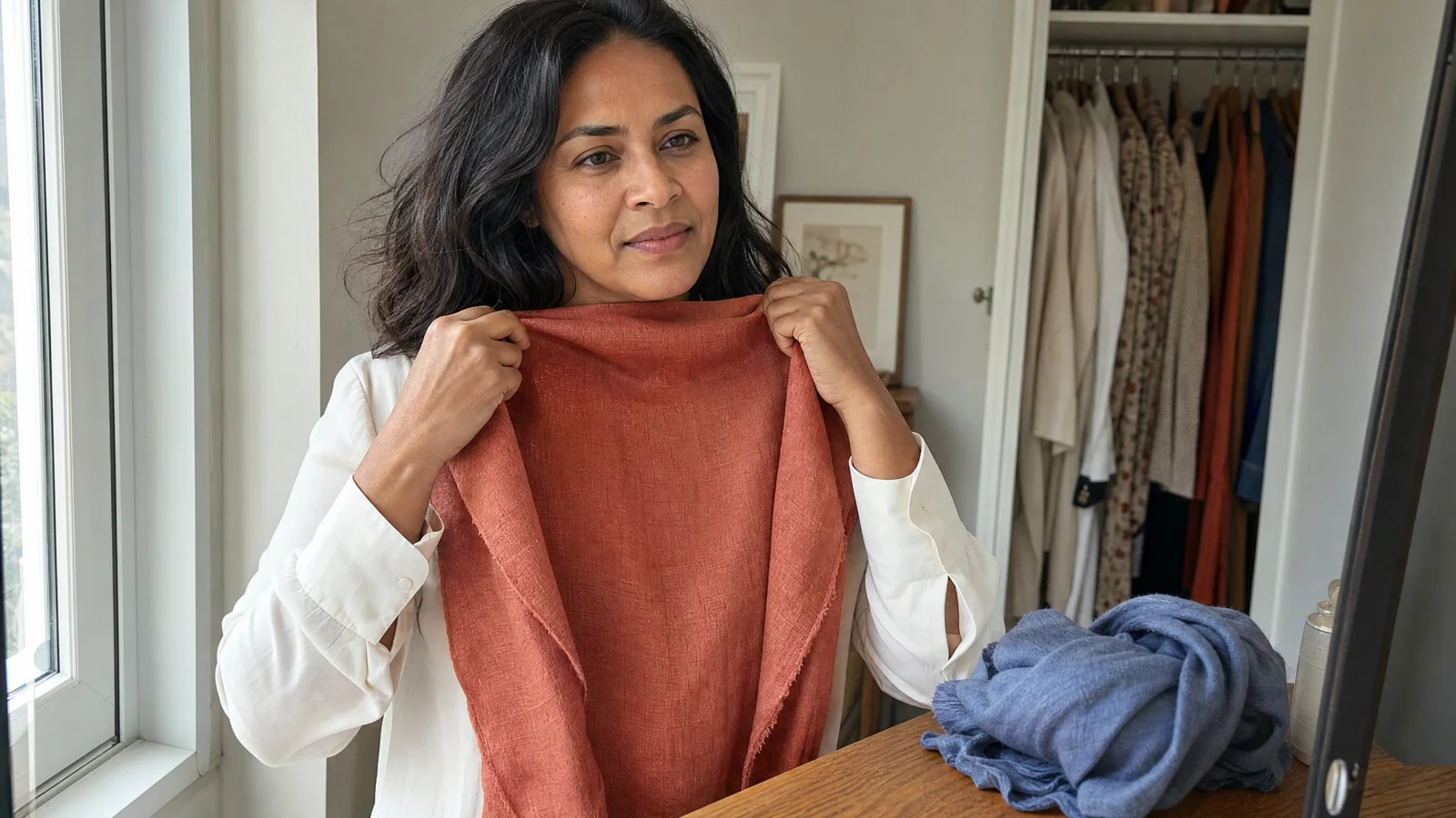
Avoid direct sun and colored lamps.Look at your face.
Keep the mirror and your position still.Swap one thing.
Try the next fabric in the same place.
Which colors belong to each palette?
The full clothing palettes.
Here are the nine clothing colors in each set. The jewelry colors are listed in the full palette reference below.
Soft Autumn
Soft Summer
Colors from the Stef's Closet season palettes. Compare actual fabrics in daylight to see which ones you like near your face.
See each set together in the Soft Autumn guide and the Soft Summer guide. You may like a few soft blue-greens and pinks from both groups. But the two groups are still different.
Can you wear colors from both seasons?
You may like a few colors from both. This is common when your skin is close to neutral, meaning it does not look clearly warm or cool. Alice at Soul of Color suggests four more pairs: Soft Terracotta and Muted Mauve, Beige and Soft Gray, Dusty Teal and Soft Lavender, then Muted Olive and Muted Purple.
Both groups have soft colors, so you may like a few from each. Warmth still matters. If Camel consistently looks better than cool taupe, start with everyday browns from Soft Autumn. If cool taupe wins, Soft Summer is the safer place to begin.
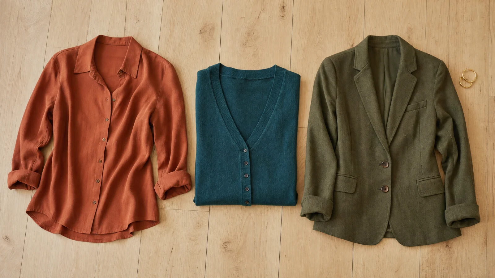
Warm colors you can picture wearing.
Terracotta, Deep Teal and Olive are three clothing colors from the Soft Autumn palette.
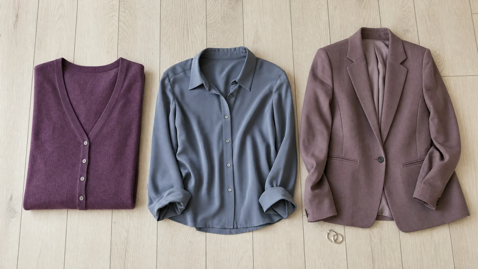
Now look at the cooler group.
Dusty Plum, Steel Blue and Antique Mauve bring the Soft Summer colors into clothes.
Can hair color or veins settle it?
Hair can give you a clue, but it cannot decide your season by itself. Hair dye, self-tan and indoor light can change what you see. Curate Your Style also advises skipping the vein test here. It is not reliable for skin that is close to neutral, especially on deeper skin.
Fabric near your face gives you a better comparison. The site's warm versus cool skin-tone guide explains what to watch for, and the gold or silver guide gives you a simple first test.
What if your tests are still split?
Do not buy new clothes after just one unclear color test. Set aside the clearest warm and cool winners from your closet and wear each near your face for a full day. Check them in daylight and ordinary indoor light.
The free five-question color analysis asks whether your skin leans warm, cool or neutral. It also uses your hair and eye colors. You get one season and a named set of colors to compare with the clothes you tested.
Start tomorrow with camel and cool taupe. Keep the better one beside your face, then test two more pairs from the same warm or cool group.
Open the full palette reference
A few more answers
What do Soft Autumn and Soft Summer share?
Both seasons use gentle colors. Most are neither very light nor very dark. Hair, skin and eyes may also look close together in lightness.
How can you tell them apart?
Compare warm and cool colors that are equally soft. Curate Your Style recommends soft gold versus silver, camel versus cool taupe, and warm cream versus cool off-white.
Can you wear colors from both seasons?
You may like a few colors from both. This is common when your skin is close to neutral, meaning it does not look clearly warm or cool. Alice at Soul of Color suggests four more pairs: Soft Terracotta and Muted Mauve, Beige and Soft Gray, Dusty Teal and Soft Lavender, then Muted Olive and Muted Purple.