The deep winter swaps
Deep winter colors to avoid, and what to wear instead
Camel, cream and peach each have a deep winter replacement. Keep what you own and change the color nearest your face.
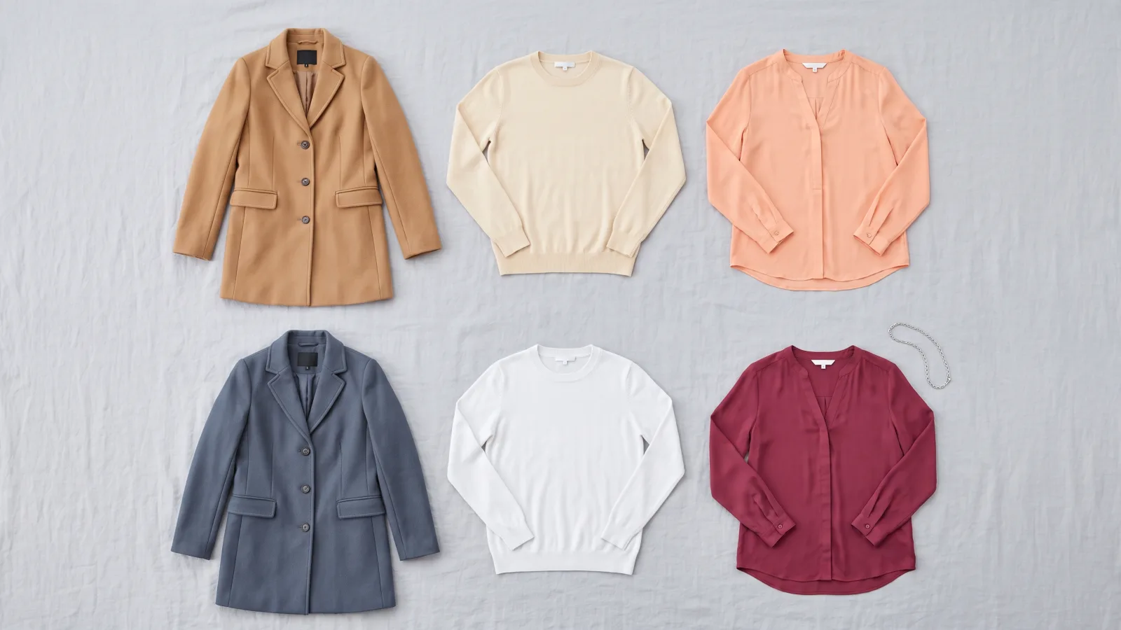
The main deep winter colors to avoid are the warm ones, like camel or cream. Each one has a named swap in the twelve-color deep winter palette, so you change the color nearest your face instead of throwing the garment away.
Curate Your Style calls this season Dark Winter, which is its name for Deep Winter. Its advice is to avoid "warm yellow golds, oranges, beige, camel and peach" because these colors "will drain your cool colouring rather than bring it to life." The page was checked on October 8, 2026.
Soul of Color lists six colors to avoid for Deep Winter. It names Light Spring as the opposite season and explains, "Light and warm hues can detract from your striking, cool depth." That page was also checked on October 8, 2026.
Four warm colors, and the deep winter color to wear instead.
The left chip in each pair is the avoided color, drawn from a warm season's palette. The right chip is its replacement from the deep winter palette.
Camel to Slate
A swap by job. Slate does the everyday work of a camel coat, in a cool color.
Cream to Frost White
A genuine close neighbor. You keep the pale look without the yellow.
Peach to Berry Rose
A swap by family. Both sit near pink, and Berry Rose is cooler and deeper.
Orange to Oxblood
A swap by family. The warm orange becomes a dark, cool red.
Why should Deep Winter avoid warm colors?
Warmth is the main problem because yellow or orange near your face can make cool coloring look dull. Lightness becomes a problem when the shade is also warm or has a dusty pastel look. Pale color alone is not the issue.
Frost White is very light, and Silver is light too. Both belong in the palette. A cream sweater has a creamy yellow cast, while Frost White is a cool pale neutral. This is why a rule against every light color would send you in the wrong direction.
Dusty color needs a little more care. Smoked Plum is soft, but it is also much darker than dusty mauve. In this palette, the soft colors are dark ones. Curate says light and warm pastels "wash the colouring out rather than lifting it."
What can you wear instead of these colors?
The useful swap may match the color family or the role of the garment. It is not always a close visual match.
| Avoided color | Why, from the sources | Wear instead |
|---|---|---|
| Camel | Curate says camel has too much yellow and can make your complexion look dull. | Slate. This is a swap by job for an everyday coat neutral, not a look-alike. |
| Beige and cream | Curate lists beige. Soul of Color lists cream among its six avoided colors. | Frost White. Cream is a genuine near neighbor, and beige goes to the same cool pale neutral. |
| Peach, apricot or coral | Curate lists peach. Soul of Color lists apricot and coral. | Berry Rose. This is a swap by family, not a look-alike. |
| Orange and rust | Curate lists orange and rust among the warm shades to avoid. | Oxblood. This is a swap by family, with the deeper color better suited to the season. |
| Warm yellow gold and mustard | Curate warns against warm yellow gold. Its guidance also says dusty yellow clashes. | There is no clothing replacement because the pack has no yellow. For gold jewelry, choose Silver or White Gold. |
| Warm chocolate brown | Curate says this brown has too much yellow. | Ink, the pack's darkest neutral. |
| Warm taupe | A warm taupe has the same yellow cast as camel. | Slate, the nearest deep winter color. Test a cool, grayer taupe in daylight before giving it away. |
| Dusty mauve and warm pastels | Both sources warn about warm pastels. Curate also cautions against warm muted shades. | For dusty mauve, choose Smoked Plum. It is the closest match, but it is much darker. |
Every swap on this page was looked up against the deep winter palette, so you are swapping a color rather than losing one.
Camel to Slate is the clearest example of a swap by job. Slate will not look like camel. It fills the same place in your closet as a neutral coat or pair of trousers. Peach to Berry Rose works differently because both sit in the pink-red family, though Berry Rose is cooler and deeper.
There is no honest clothing swap for mustard or warm yellow gold. Choosing a made-up yellow would defeat the point of using the pack. If the warm gold is jewelry, wear Silver or White Gold, two of the pack's three metals.
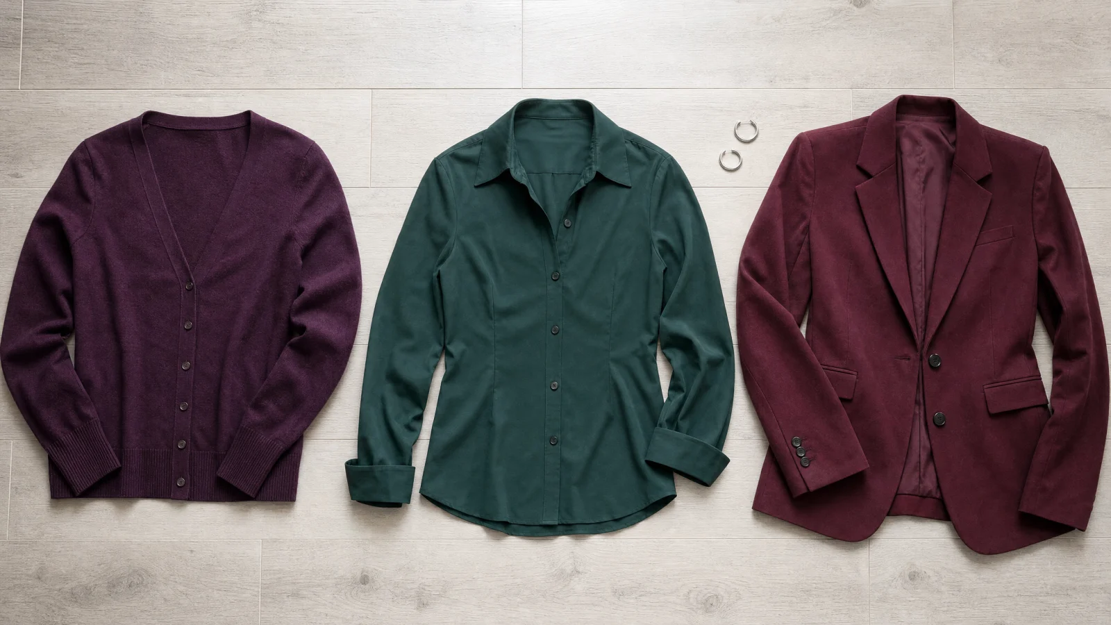
Deep winter color, as clothes.
Oxblood is the swap for orange and rust on this page. Blackberry and Pine are two more deep colors from the same palette. The fabric sits near those palette colors rather than matching them exactly.
Does Deep Winter mean wearing black all the time?
Black is allowed, but it is not your only answer. Curate says black "does appear in the Dark Winter palette." The same source says many people come to this season "after years in black" because they thought depth and coolness were the same thing. "They are not," it adds.
Ink is the darkest color in this pack, so you can use it in many of the places where you would reach for black. See the full set in the deep winter season guide instead of treating one dark neutral as the whole season.
Brown also needs a narrower rule. Curate includes espresso and brown-black among its good neutrals. The brown to avoid here is warm chocolate brown with a yellow cast. Use Ink for that deep-neutral role.
Can a deep winter wear taupe?
Taupe is a gray-brown, and it can lean warm or cool. A warm taupe with a yellow or pink cast sits with camel, so wear Slate instead. Slate is the closest deep winter color to warm taupe by measurement, and it is a cool blue-gray.
A Reddit thread in r/coloranalysis asked this exact question in October 2026, and the answers were split. One reply said taupes "have varying levels of grey" and "You'd have to judge it in person." Curate Your Style lists cool stone among good Dark Winter neutrals, so a grayer taupe is worth testing at a window before you give it away.
What to do with the ones already in your closet?
Keep the camel coat and the cream sweater. You only need to change what sits closest to your face. Under the camel coat, wear a Frost White or Berry Rose top that shows at the neckline. You could add a Slate or Ink scarf instead.
Move a warm piece below the waist. Camel trousers or a rust skirt can stay because the color is farther from your face. With a cream sweater, put one of the deeper palette colors at the neckline, or layer it so little shows near your face.
Take two daylight photos when you are unsure. Face a window with the warm color at your neckline, then take the second photo from the same spot after adding the cool swap. Look at your skin and the shadows under your eyes before you look at the garment.
Same light. Same spot. Change the fabric.
Face a window with soft daylight. Compare one fabric at a time, keeping everything else the same.

Avoid direct sun and colored lamps.Look at your face.
Keep the mirror and your position still.Swap one thing.
Try the next fabric in the same place.
How can you tell whether a store's shade is right?
Check the actual fabric in daylight because color names are loose. Curate warns that "One brand's charcoal is another's slate."
Hold the item beside the palette near a window. Compare the shade you can see, not the name on the tag. If you are unsure whether you fit true winter or deep winter, compare them first because they use different levels of depth.
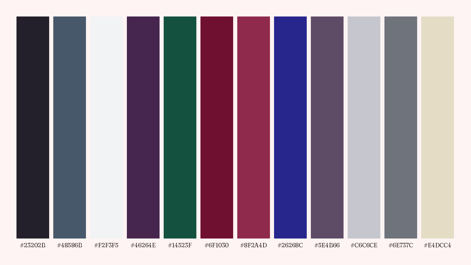
The whole deep winter palette.
Every replacement on this page comes from these twelve colors. The last three are metals for jewelry and hardware.
Where can you find the rest of your season?
The season hub has the wider set of season guides. If you are checking a different closet, the soft autumn colors to avoid article uses the same kind of replacement list for that season.
If you do not know your season yet, the free color analysis asks five questions and shows you a season with a palette of colors to try.
Tomorrow, put a Frost White top under the camel coat and look at the result in daylight.
Open the full palette reference
A few more answers
Why should Deep Winter avoid warm colors?
Warmth is the main problem because yellow or orange near your face can make cool coloring look dull. Lightness becomes a problem when the shade is also warm or has a dusty pastel look. Pale color alone is not the issue.
What can you wear instead of these colors?
The useful swap may match the color family or the role of the garment. It is not always a close visual match.
Does Deep Winter mean wearing black all the time?
Black is allowed, but it is not your only answer. Curate says black "does appear in the Dark Winter palette." The same source says many people come to this season "after years in black" because they thought depth and coolness were the same thing. "They are not," it adds.
Can a deep winter wear taupe?
Taupe is a gray-brown, and it can lean warm or cool. A warm taupe with a yellow or pink cast sits with camel, so wear Slate instead. Slate is the closest deep winter color to warm taupe by measurement, and it is a cool blue-gray.
What to do with the ones already in your closet?
Keep the camel coat and the cream sweater. You only need to change what sits closest to your face. Under the camel coat, wear a Frost White or Berry Rose top that shows at the neckline. You could add a Slate or Ink scarf instead.
How can you tell whether a store's shade is right?
Check the actual fabric in daylight because color names are loose. Curate warns that "One brand's charcoal is another's slate."
Where can you find the rest of your season?
The season hub has the wider set of season guides. If you are checking a different closet, the soft autumn colors to avoid article uses the same kind of replacement list for that season.