The light border
Light spring vs light summer: warm or cool?
Two pale palettes, one warm and one cool. See which direction belongs near your face, then test it with a top you already own.
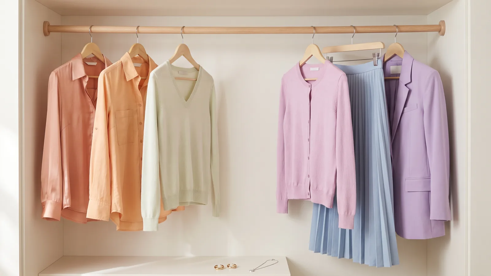
Both Light Spring and Light Summer are light seasons, so depth cannot tell them apart. Warmth decides because Light Spring is warm and Light Summer is cool. If both palettes look close, hold two versions of the same pale color beside your face. One should be warm, the other cool.
Depth means how light or dark the whole palette is. These two seasons share the light end of the 12-season system. Your answer has to come from a different part of the color.
Two light seasons, and the difference is the warmth.
Both examples are pale all the way through, hair included. Look past how light they are and at whether the whole face leans golden or cool.

Pale all through, and warm with it.
- Golden blonde hair and green eyes.
- Nothing in her face is dark, and the warmth is easy to see.
Light Spring keeps that paleness and leans warm. Try Fresh Apricot and Petal Pink.

Pale all through, and cool with it.
- Ash blonde hair and gray-blue eyes.
- Nothing in her face is dark, and the coolness is easy to see.
Light Summer keeps that paleness and leans cool. Try Powder Blue and Wisteria.
These are example color patterns. A season includes many skin tones and eye colors. You do not need to look like the example. Hair and eyes give clues; compare fabrics near your face before choosing a season.
What separates Light Spring from Light Summer?
Undertone separates them. Undertone means the warm or cool direction beneath a color. Light Spring leans warm. Light Summer leans cool.
The site's season rules were run on September 17, 2026, at light depth with balanced color intensity. Across every hair color, every eye color and every contrast value, each warm input returned Light Spring. Each cool input returned Light Summer. Nothing else changed the answer.
The question the free color analysis settles here is undertone. It asks which metal makes your face look brighter: gold or silver. It falls back on your hair and eye color only when you answer that both look good.
Warm pale on one side, cool pale on the other.
Both sets sit at the same pale level, so warmth is the only thing that changes between them. Petal Pink appears on both sides, in two different versions.
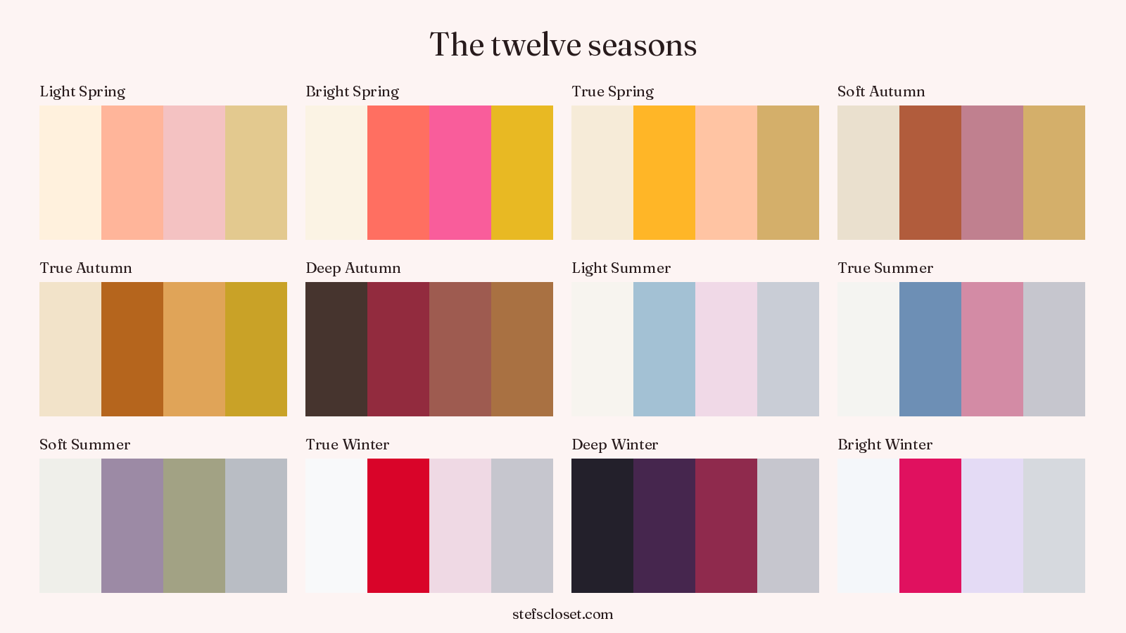
Light Spring
Light Summer
Colors from the Stef's Closet season palettes. Compare actual fabrics in daylight to see which ones you like near your face.
That does not mean every Light Spring woman looks plainly golden or every Light Summer woman looks plainly cool. Both seasons can sit near neutral. The difference becomes easier to see when the color near your face changes but its lightness stays almost the same.
Why does ColorisLab lead with chroma?
ColorisLab gives chroma the lead instead. Chroma means how clear or gray a color looks. Its premise is that both seasons are light with low contrast, and both can look neutral at a glance. Its FAQ says, "The primary difference is chroma."
That is a fair way to explain why the pair causes trouble. ColorisLab also says the vein test and jewelry test are less reliable for a neutral-leaning person. A wrist can show both blue and green veins. Gold and silver can both look acceptable, so neither test gives you a clean answer.
That warning applies to the metal question in the quiz here too. It is why the quiz lets you answer that both metals look good. In that case the answer comes from your hair first and your eye color second.
Gabrielle Arruda names both axes. She describes Light Spring as warmer and clearer, then Light Summer as cooler and more muted. Soul of Color calls temperature "the main determining factor" and treats brightness as the smaller difference.
This article puts warmth first because that is what separates these two labels in the site's rules. Chroma still matters when deciding whether either light season fits at all. Mutedness leads on the True Summer and Soft Summer border, since both choices there are cool.
What does Light Spring look like?
Light Spring uses pale color with a warm direction. Think warm pink with fresh apricot. Ivory can make more sense near your face than a blue-white, while a clear warm aqua may work better than a dusty blue.
Pale color, kept on the warm side.
Three ordinary pieces in the Light Spring colors named underneath. The fabric sits near those palette colors rather than matching them exactly.
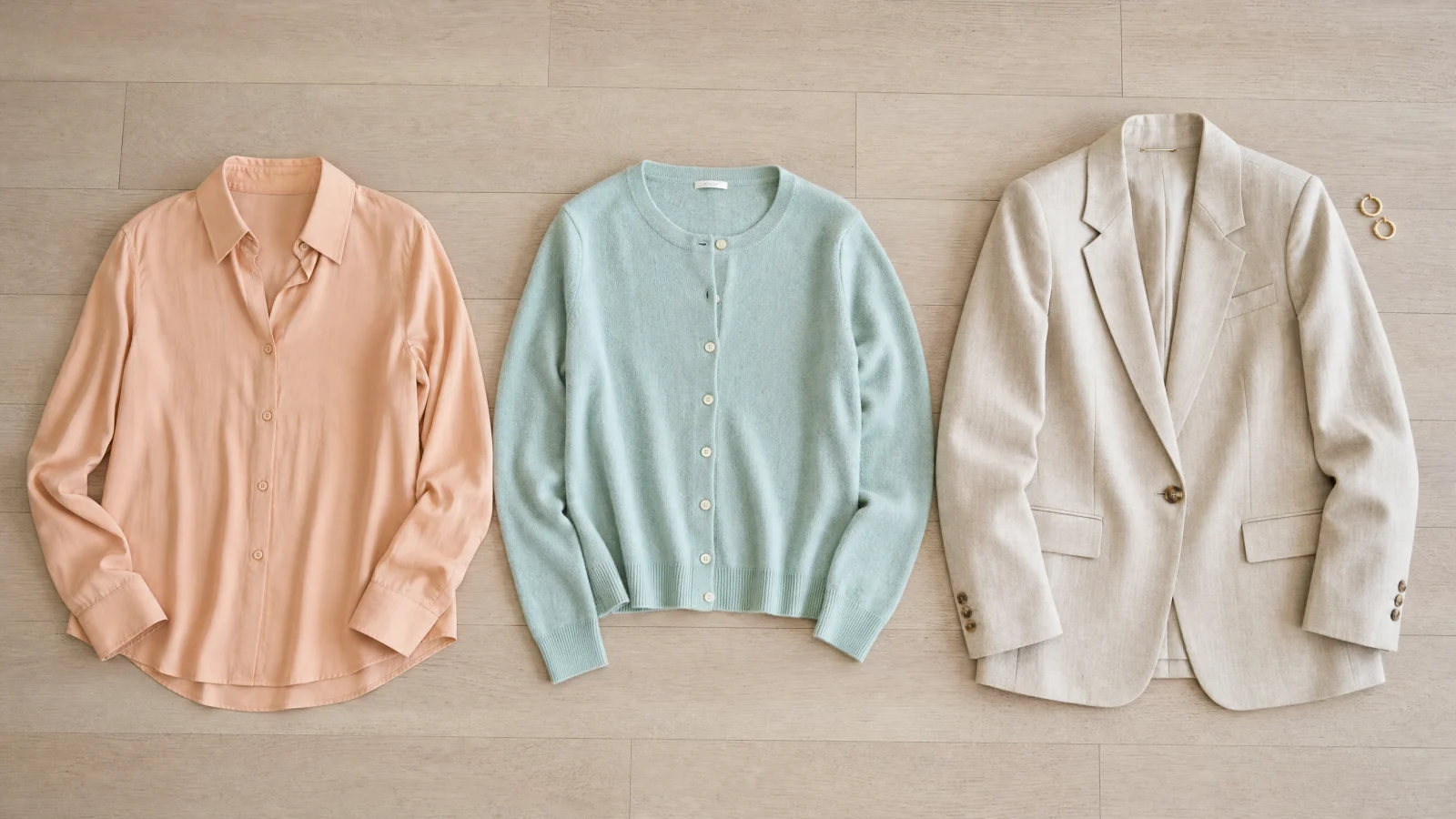
In the mirror, the right warmth may leave your skin looking even. Your eyes may look clearer without extra makeup. A cool pastel can leave the same face looking tired even though the color is light enough.
The Light Spring guide shows the full palette together. Use that set to see the range, but test one close pair when you need to make the final choice.
What does Light Summer look like?
Light Summer uses pale color with a cool direction. Think cool pink with powder blue. Lavender can sit more naturally near your face than peach, while soft gray may make more sense than creamy ivory.
The same paleness, turned cool.
The same kind of pieces in Light Summer colors. Hold one beside a Light Spring piece and the change in warmth becomes easy to see.
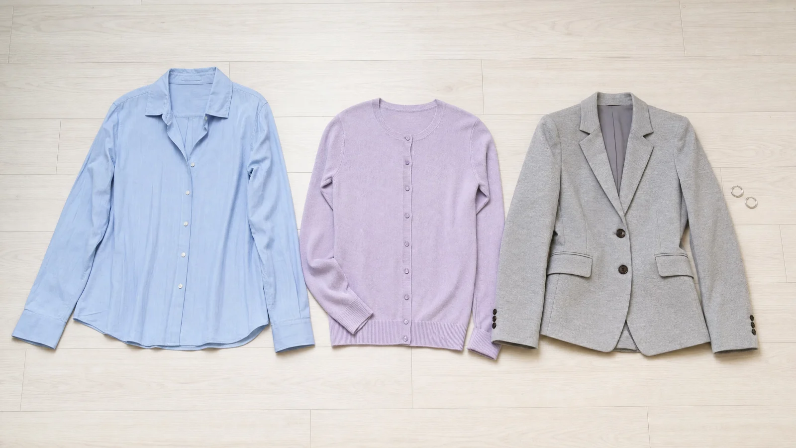
In the mirror, the cooler choice may make redness look quieter. Your features may look more even. A warm pastel can make the face look yellow or separate from the cloth, even when the shade is not too dark.
The Light Summer guide shows its full palette. Warmth also decides the Soft Autumn and Soft Summer border. That comparison uses softer colors, but the warm-cool question is the same.
Can you simply be Light?
The top organic result for this query is a Reddit thread that tells the reader, "You could just be 'light'." It also says, "Seasonal color analysis isn't an exact science." That can be a useful reminder not to force a label from one photograph, but it does not answer the clothing question.
Every dedicated source checked for this article says the two seasons can be separated. The sources disagree about which axis should lead. They do not say the distinction disappears.
If both groups look possible, do not decide from your hair or a favorite metal. Compare cloth near your face in steady daylight. You are looking for a repeatable change, not a perfect label from one glance.
Why are the two Petal Pinks useful?
Both palettes contain a color called Petal Pink, but they are different colors. This gives you a direct comparison without changing the color name or moving to a much darker shade.
| Season | Petal Pink | Direction |
|---|---|---|
| Light Spring | #F4C2C2 | warm |
| Light Summer | #F0D9E7 | cool |
The Light Spring pink measures 86 percent lightness. The Light Summer pink measures 90 percent. They are only four points apart, so lightness is held still and warmth is the only change you need to judge.
No article in this query's top ten publishes a single hex value. The palette cards here publish twelve colors for each season. That lets you find the exact Petal Pinks instead of guessing what two writers meant by pale pink.
The Concept Wardrobe runs the only dedicated head-to-head page for this query. Its Light Spring palette and its Light Summer palette were each sold as a 19.99 USD product, and both were out of stock when checked on September 17, 2026. The same page also rendered a Bright Spring wardrobe module by mistake.
How can I test the Petal Pinks at home?
Use the two hex values as your targets, then compare the closest cloth you own. Keep the test simple so the light in the room does not make the choice for you.
Same light. Same spot. Change the fabric.
Face a window with soft daylight. Compare one fabric at a time, keeping everything else the same.
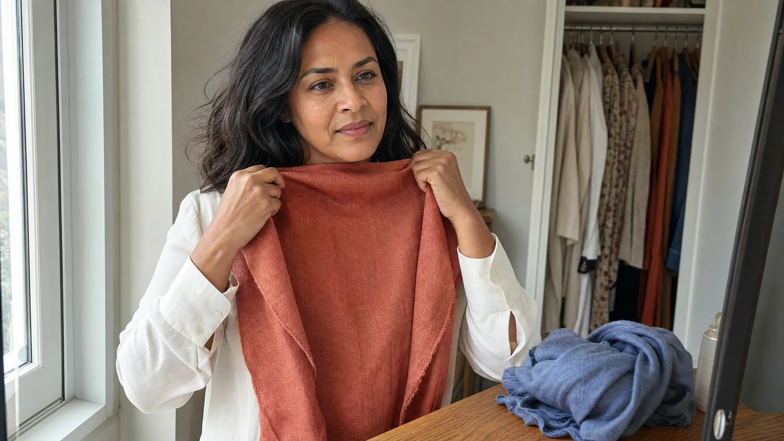
Avoid direct sun and colored lamps.Look at your face.
Keep the mirror and your position still.Swap one thing.
Try the next fabric in the same place.
- Find two tops or fabric pieces that come close to
#F4C2C2and#F0D9E7. - Stand at a window in daylight, with no strong makeup near the skin you are comparing.
- Hold the Light Spring pink under your face and look at your skin rather than the cloth.
- Swap to the Light Summer pink in the same place, keeping your distance from the window unchanged.
- Repeat the swap once. Choose Light Spring if your face looks more even beside the warm pink, or choose Light Summer if it looks more even beside the cool pink.
Warmth is easiest to read in even daylight, so do not settle this under a lamp. Put the two pink pieces by the window tonight and compare them there tomorrow, before you buy anything for either palette.
Open the full palette reference
A few more answers
What separates Light Spring from Light Summer?
Undertone separates them. Undertone means the warm or cool direction beneath a color. Light Spring leans warm. Light Summer leans cool.
Can you simply be Light?
Every dedicated source checked for this article says the two seasons can be separated. The sources disagree about which axis should lead. They do not say the distinction disappears.
How can I test the Petal Pinks at home?
Find two pieces close to Light Spring Petal Pink #F4C2C2 and Light Summer Petal Pink #F0D9E7. Hold each under your face at a window in daylight and watch your skin rather than the cloth.