The winter comparison
True winter vs deep winter: what decides it
Two cool winter palettes, one dark and one clear. See which depth belongs near your face, then try it with clothes you own.
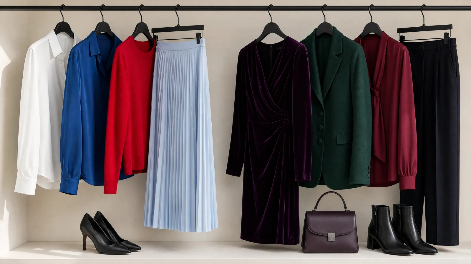
Warmth cannot separate true winter from deep winter because both are cool. Depth decides first: genuinely dark, cool coloring is deep winter, while cool coloring that reads clear rather than dark is true winter.
That order matters. If you start by asking which palette is cooler, the answer may change with every top you try. Settle how dark your coloring reads as a whole before comparing the two palettes in the winter color palette guide.
Why can't warmth separate true winter from deep winter?
Both seasons belong to the cool winter family. Warmth does not give you a steady way to choose between them. The choice becomes clearer when you ask whether depth or cool clarity is your leading feature.
Alice at Soul of Color frames the split as "True Winter: coolness is primary" and "Deep Winter: depth (darkness) is primary." Her wording keeps the decision on the feature that leads. It also explains why a cool result on its own cannot finish the job.
Six colors that show the split.
Read down each column and ignore temperature for a moment. Nothing on either side is warm. What changes is how close the colors sit to black.
True Winter
Deep Winter
Colors from the Stef's Closet season palettes. Compare actual fabrics in daylight to see which ones you like near your face.
Depth comes from your coloring as a whole. Hair carries the most weight. Skin and eyes move the result from there, so no single feature settles it alone.
The quiz reads how dark your hair, skin and eyes sit together, so depth is settled from your own coloring instead of from a guess.
Could I be bright winter instead?
Yes. Cool coloring with clear chroma and high contrast points to bright winter, even when your overall depth is dark. Chroma means how clear or how grayed a color is.
For cool, deep coloring there are nine ways the two other traits can land. Eight of them give deep winter. The one exception is clear chroma with high contrast between your hair and your skin, and that combination gives bright winter.
The third winter, in four colors.
If these read as your kind of color rather than the deeper set, you are looking at bright winter. Notice how much light sits inside them.
So this is a third possibility after you have decided your coloring is dark and cool. Deep winter is still the usual answer at that depth. Clear color with strong contrast is what changes it.
Two kinds of cool coloring.
Look at how far the hair sits from the skin, then at how much light is in the eyes. Both examples are cool, so depth is the thing to compare.

Cool color comes first.
- Dark, ash-toned hair and cool gray-blue eyes.
- Her hair is much darker than her skin.
True Winter puts coolness first. Try Sapphire and Icy Blue beside your face.

Depth comes first.
- Very dark hair and deep brown eyes stand out first.
- The whites of her eyes add a clear light-and-dark difference.
Deep Winter starts with depth and leans cool. Try Pine and Blackberry.
These are example color patterns. A season includes many skin tones and eye colors. You do not need to look like the example. Hair and eyes give clues; compare fabrics near your face before choosing a season.
What makes deep winter different?
Deep winter is the dark-first result. Your coloring reads genuinely deep, and it is already cool. The palette stays dark without using warmth as the deciding test.
Ink is the darkest neutral. Slate sits beside it, and Frost White holds the pale end. The rich colors are where the season shows itself. Try Blackberry and Pine first.
The deep set, in clothes.
These are the colors to reach for when plain black feels flat on you. Every one of them is dark without being warm.
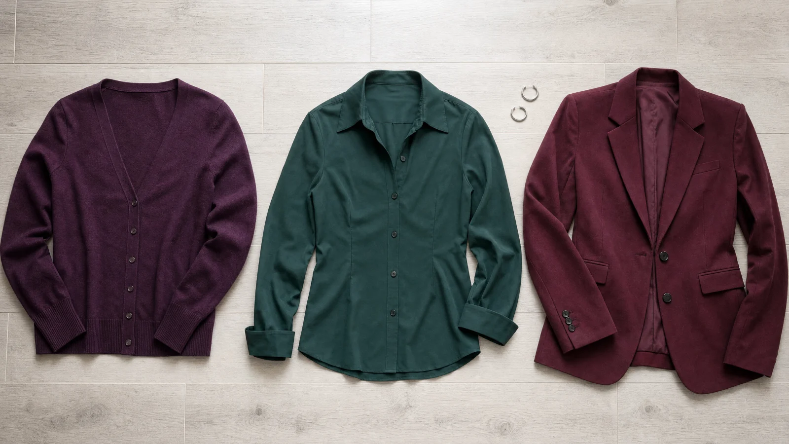
If those deep shades make more sense near your face than a clear Black does, work from the deep winter guide for the full season.
What makes true winter different?
True winter is the cool-first result, and its colors read clear rather than mainly dark. Hannah and Sophia Rashad at Curate Your Style call true winter "the coolest of the three palettes." That puts coolness at the center, but depth is still what separates it from deep winter.
Crisp White and Black hold the neutral edge. The color is clean and saturated. True Red and Sapphire lead it. Icy Pink and Icy Blue sit at the light end.
The clear set, in clothes.
Hold these against the deep set above. The difference you are looking for is brightness, not warmth.
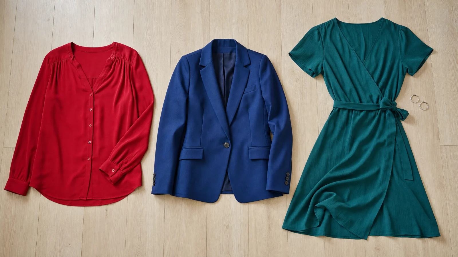
If your face reads clearer with that set than with the deeper one, open the true winter guide.
How do the two palettes differ side by side?
Put the two sets next to each other and the difference is darkness, not warmth. Neither set of clothing colors has a warm brown, a camel or a golden yellow in it. What changes is how far the colors sit from black.
The two clothing palettes in full.
Nine clothing colors each, with the metals listed in the season guides. Scan the light end of both columns. True winter keeps two icy pastels where deep winter keeps a single frost white.
True Winter
Deep Winter
Colors from the Stef's Closet season palettes. Compare actual fabrics in daylight to see which ones you like near your face.
Black and Ink are the darkest neutrals in their sets, and they look almost the same on a screen. That is why the useful home comparison is never one black against another. Compare Black with Blackberry or with Oxblood.
The same difference shows up in your closet. A true winter wardrobe carries its Black next to Icy Blue or Crisp White, so the light pieces do the lifting. A deep winter wardrobe puts Blackberry against Pine or Oxblood, and the whole outfit stays low and rich.
Why do winter season labels conflict?
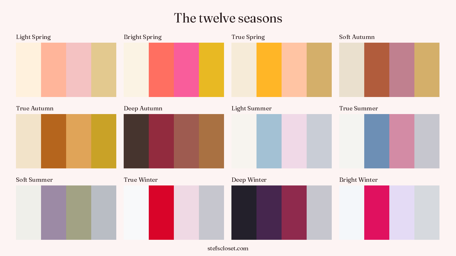
Different systems use different numbers of winter labels. Style Solutions for You counts four winter season types in the 16-season method. The twelve-season system used here has three.
That extra label changes what some pages mean by true winter. In the 16-season method, Cool Winter sits beside True Winter as a separate type. So a reader can end up reading advice built for four choices while trying to choose between three.
The names vary too. One page may say dark winter where another says deep winter. Fix the system first, then compare descriptions. The season guide hub keeps you inside the twelve-season version this site uses.
Every sister pair has its own deciding trait. For the two muted seasons it is warmth rather than depth, which the soft autumn vs soft summer guide works through.
How can I test true winter vs deep winter at home?
Compare Black with Blackberry or Oxblood in daylight by a window. Watch your face rather than the fabric. One pair should give you one answer about depth.
Same light. Same spot. Change the fabric.
Face a window with soft daylight. Compare one fabric at a time, keeping everything else the same.

Avoid direct sun and colored lamps.Look at your face.
Keep the mirror and your position still.Swap one thing.
Try the next fabric in the same place.
- Stand beside a window during daylight.
- Hold a Black top at your face and look only at your face.
- Replace it with a Blackberry or Oxblood top without changing the light.
- Choose the side where your face looks clearer and more even.
Do that tomorrow. If Black wins, open the true winter guide. If Blackberry or Oxblood wins, open the deep winter guide.
Open the full palette reference
A few more answers
Why can't warmth separate true winter from deep winter?
Both seasons belong to the cool winter family. Warmth does not give you a steady way to choose between them.
Could I be bright winter instead?
Cool coloring with clear chroma and high contrast points to bright winter, even when your overall depth is dark. Chroma means how clear or how grayed a color is.
How can I test true winter vs deep winter at home?
Compare Black with Blackberry or Oxblood in daylight by a window. Watch your face rather than the fabric. One pair should give you one answer about depth.